Ready.net
A SaaS platform for utility regulators, funders, and broadband operators, shaped through brand systems, web design, and product-adjacent digital experience.
Type
Case Study
Timeframe
Long-term engagement
Toolkit
Figma, Adobe Creative Cloud, Pitch, Slack, Notion, Linear
Year
2022 – Present

Problem
Ready.net needed a brand and digital presence that could speak credibly to very different audiences, from rural cooperatives to broadband operators to government stakeholders. As the first designer, the challenge was to create a system that felt cohesive, flexible, and mature enough to support a growing company across web, marketing, and investor-facing touchpoints.
Solution
I built and evolved Ready’s visual identity across the website, marketing materials, design systems, and investor-facing assets. The result was a clearer and more consistent brand presence that helped the company communicate with confidence across audiences while supporting growth, fundraising, and broader visibility in the broadband space.
Context
When I joined Ready, the company was still defining how it wanted to present itself across brand, web, and digital touchpoints. As the first designer, I wasn’t just creating visual assets. I was helping build a design foundation that could support a growing business, multiple audience types, and an evolving position in the broadband space.
That challenge changed over time. Early on, the brand needed to feel trustworthy and approachable for rural electric cooperatives. As the company expanded further into broadband and software, the design had to feel more modern and differentiated for internet service providers. Later, as government work became a larger part of the business, the focus shifted again toward clarity, professionalism, and trust.
Approach
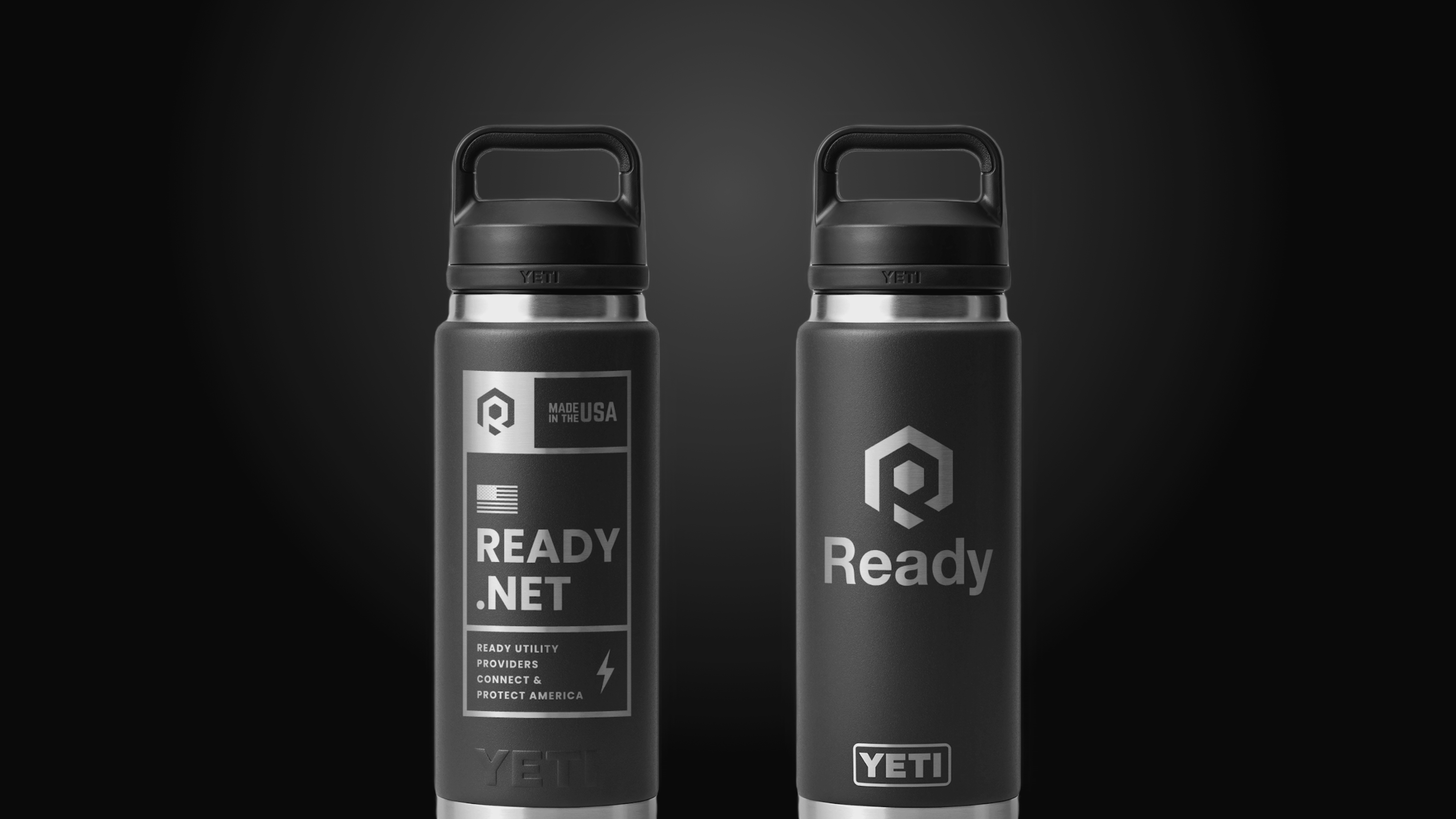
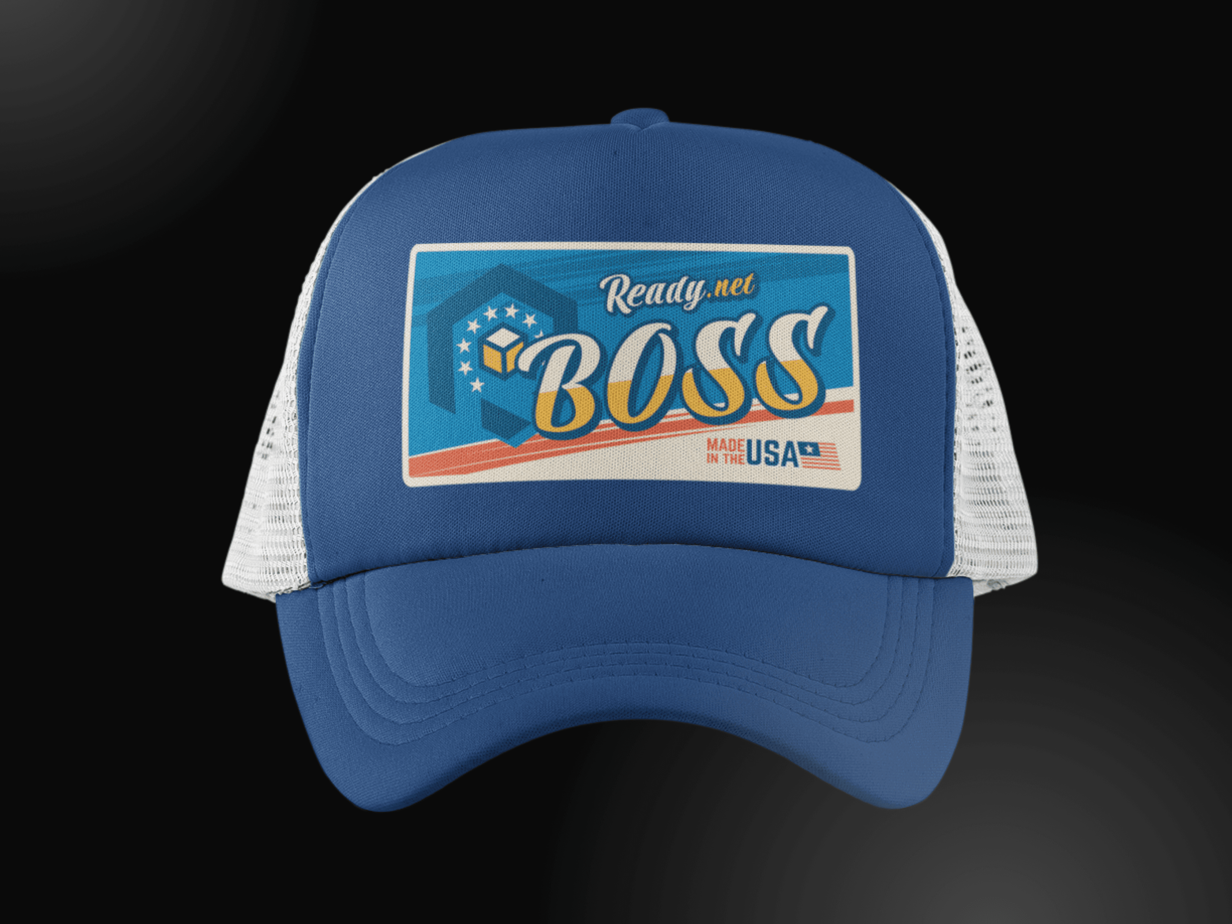
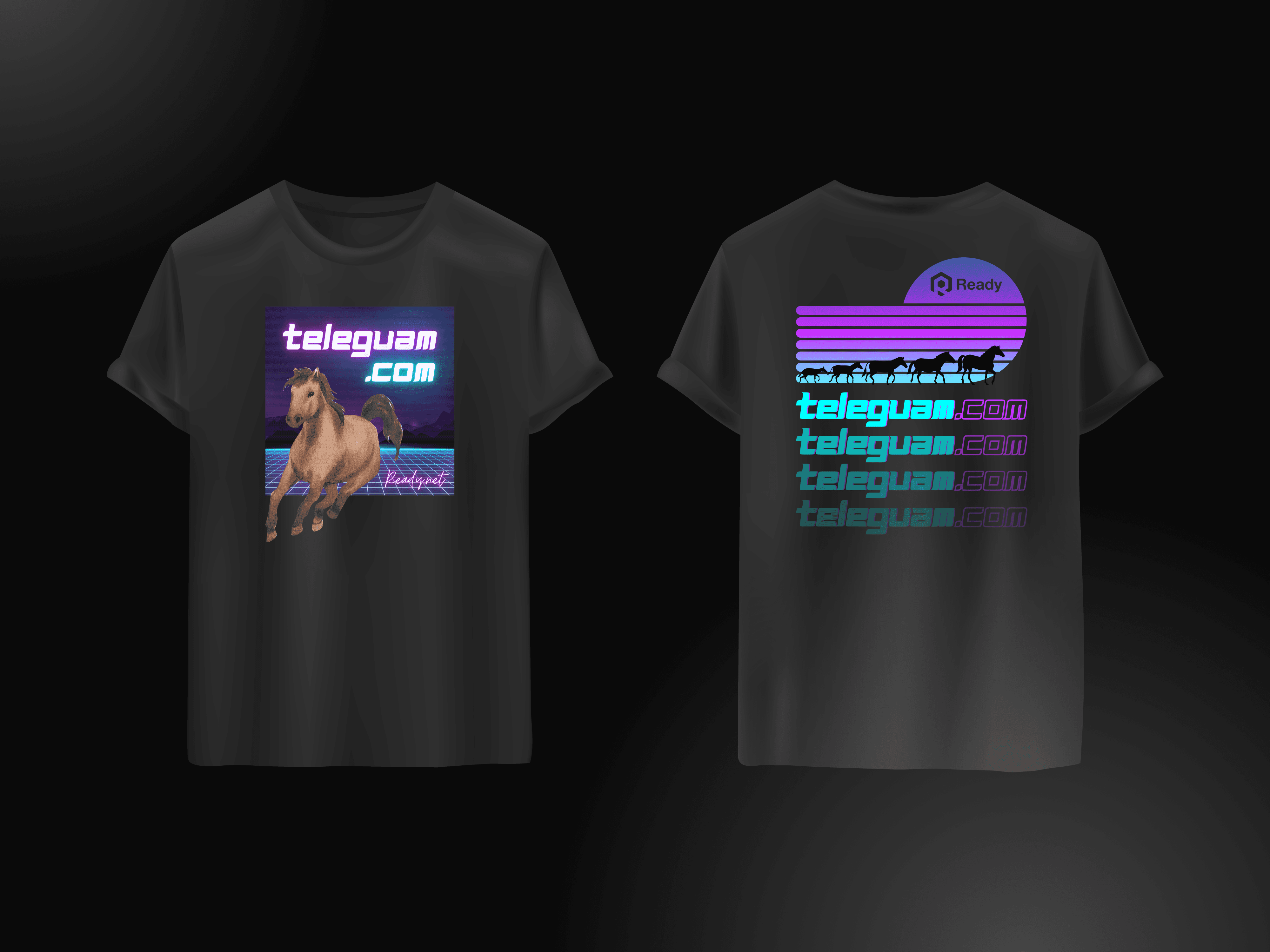
My work centered on building a brand and digital system that could evolve without losing coherence. That included shaping the visual identity, refining typography and design language, redesigning the website multiple times, and creating materials that supported marketing, conferences, fundraising, and sub-brand development.
The website became one of the most important applications of that thinking. Through multiple iterations, I focused on making the experience clearer, more usable, and more aligned with the company’s audience and positioning. Simplifying the visual language, reducing clutter, and improving navigation helped create a stronger digital presence as the business matured.
Beyond the website, I designed across a wide range of touchpoints, including investor decks, conference materials, campaign assets, and broader brand systems. The goal was to make sure every piece supported a larger story about credibility, growth, and long-term value.
Impact
The result was a stronger and more adaptable design foundation for Ready as the company expanded across audiences and business priorities. The work supported key moments in the company’s growth, including fundraising, industry visibility, and the development of a more cohesive brand ecosystem.
What made the project especially meaningful was the larger mission behind it. Ready’s work supports the organizations helping expand broadband access, and my role was to create the brand and digital systems that helped that mission feel clear, credible, and ready to scale.